






Select by Urban Jungle
B2C Insurtech | Non-standard home insurance
OVERVIEW
I designed Select, Urban Jungle’s non-standard home insurance product. Offering cover for the homes standard underwriting rejects: 6+ bedrooms, previous claims and unoccupied properties. Most of those customers start their search on price comparison websites, which are designed for one set of questions and a side-by-side list of prices. Non-standard cover needs more information to quote, and the audience ranges from people expecting a standard journey to people with genuinely complex needs.
ROLE
Product Designer
Sole designer on the project, leading the work E2E from research to delivery.
SCOPE
Research to hi-fi
Discovery, question flow, quote and checkout, and the launch build.
TIMELINE
7 weeks
From kick-off to launch on a new distribution channel, Oct - Dec 2025
SOLUTION


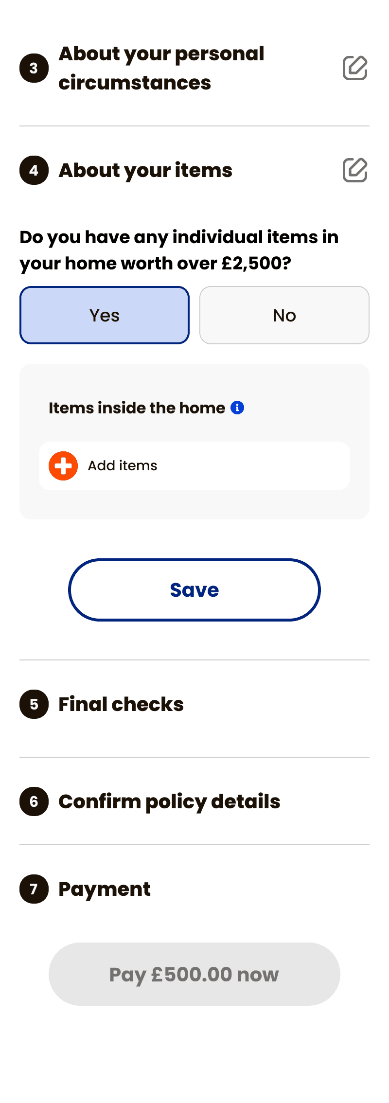
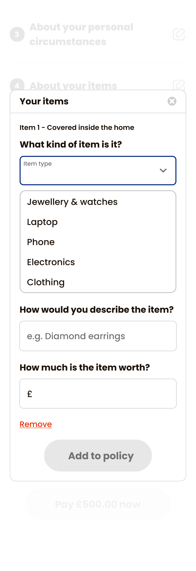
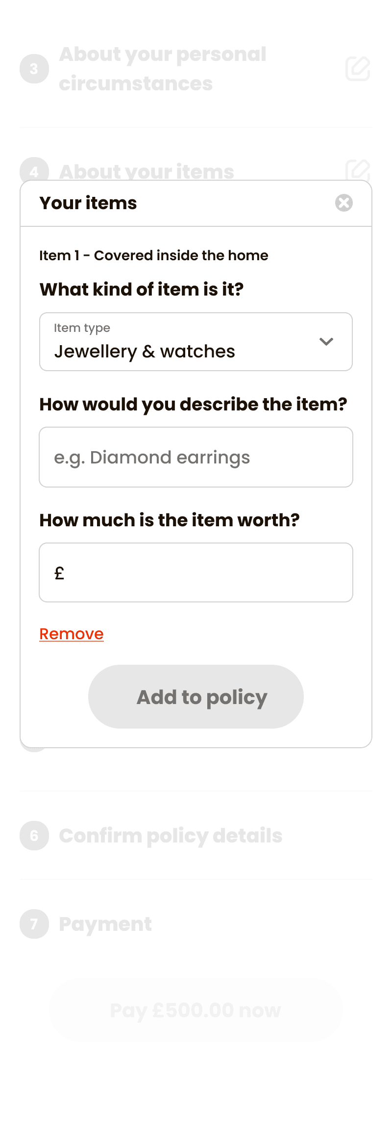
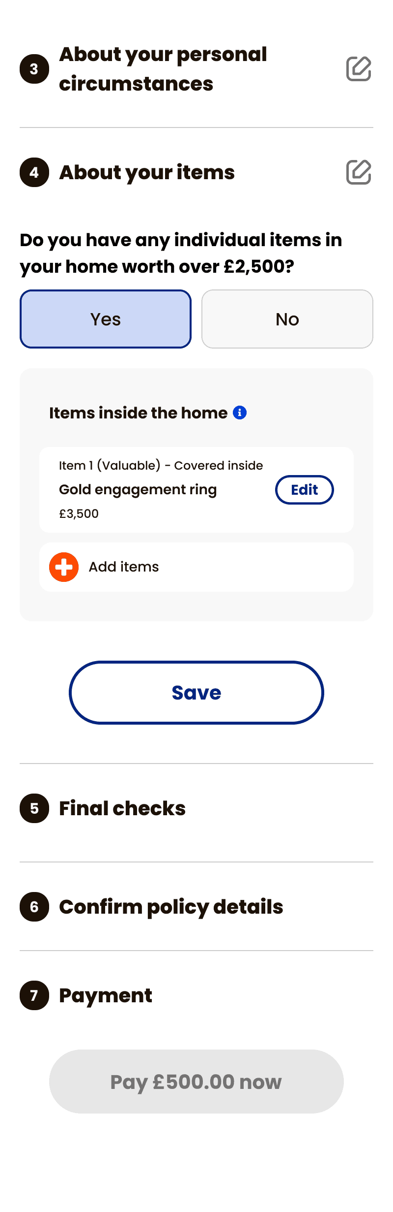
Adapting a single flow by conditional logic
I mapped out standard and non-standard user needs to design an adaptive, logic-driven question flow.
Typical users get a streamlined path, while edge-case users only see questions relevant to them as sections dynamically expand or collapse.
Stress-testing these scenarios with engineering upfront established a solid foundation for the rest of the feature.
A one page checkout
To reduce perceived effort and keep customers moving, we designed a single-page checkout. Everything a customer needed to confirm sat in one place, removing unnecessary navigation for the majority of users.

Surfacing the right information upfront
Customers arrive having already given a lot of information to PCWs. We summarised the most important details (core cover, address, add-ons) at the top of the page, so customers could immediately confirm their information had carried through correctly before purchasing.
Keeping editing simple
Most customers don't need to change their details, and with complex conditional logic throughout the flow, we didn't want to clutter the main page. If a customer did need to make changes, we directed them to a specific page to do it, keeping the action contained and out of the way of the main journey.
OUTCOME
Delivered an MVP version of our non-standard home insurance purchase journey on MoneySuperMarket to hit a hard pre-Christmas launch. A fast-follow plan was agreed alongside it to close the gap between the PCW and direct-journey eligibility once the freeze lifted.
8%
Click to purchase rate
From a comparison site to completed purchase, keeping drop-off low throughout the journey.
22%
Average MoM growth
Sustained across the first 9 months by progressively expanding eligibility.
7 weeks
Kick off to launch
From kick-off to live: scoping, designing, testing, and delivering a full PCW purchase journey end to end.
REFLECTION
External deadlines shaped the scope
Designing to hit the MoneySuperMarket launch window meant trimming the full spec down to a core MVP. Timelines weren't just a delivery constraint—they actively defined the final product experience.
Distribution channel realities structured the UX
MoneySuperMarket doesn't collect every data point needed for a quote, making post-click questions necessary rather than an edge case. Framing this as a channel constraint early shifted how we solved the problem.
Early alignment prevented handoff friction
Partnering with engineering early helped us test feasibility while the design was still fluid. This shared understanding eliminated handoff surprises and kept the final sprint moving quickly.