





IKEA UK
B2C Insurtech | White-label home insurance
An insurance product built for a brand people already trust
An insurance product built for a brand people already trust
OVERVIEW
Urban Jungle partnered with IKEA UK to launch a white-label home insurance product across direct and Price Comparison Website (PCW) channels.
The goal was to deliver a fully white-label, conversion-optimised experience across direct and PCW channels, proving that sub-brand partnerships could unlock meaningful new volume without compromising on brand integrity or user experience.
10M+
IKEA Family members in the UK
95.6%
of PCW home insurance users are on the four platforms we integrated with
53%
of consumers choose a known brand over a cheaper unknown on a PCW
This case study shows two things: the white-label experience we designed and the co-branded product that shipped. Brand approval sat with a third IKEA entity, and its restrictions landed two months before launch.
This case study shows two things: the white-label experience we designed and the co-branded product that shipped. Brand approval sat with a third IKEA entity, and its restrictions landed two months before launch.
SOLUTION
Building the brand
Building the brand
We inherited the system, not the journey. Reusing validated components is what bought us the time to spend on flow.
We inherited the system, not the journey. Reusing validated components is what bought us the time to spend on flow.
SOLUTION: PART 1
Building the brand

Re-skin, don't rebuild
Re-skin, don't rebuild
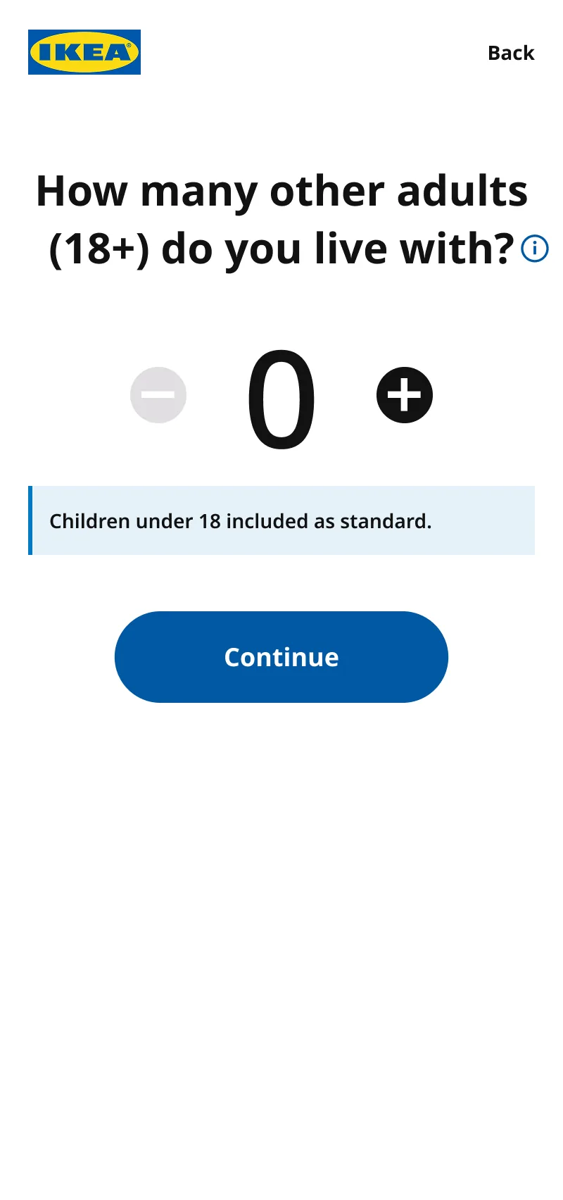
A ground-up build would have taken months, and re-litigated interaction patterns engineering had already validated.
Instead, I re-skinned Urban Jungle's existing Tailwind component library; colour, typography, iconography and photography swapped for IKEA's design language, underlying logic and interaction patterns untouched.
120+ components across Figma, Tailwind and frontend engineering services, delivered build-ready in 3.5 weeks, saving an estimated 1.5–2 months of engineering time.
A ground-up build would have taken months, and re-litigated interaction patterns engineering had already validated.
Instead, I re-skinned Urban Jungle's existing Tailwind component library; colour, typography, iconography and photography swapped for IKEA's design language, underlying logic and interaction patterns untouched.
120+ components across Figma, Tailwind and frontend engineering services, delivered build-ready in 3.5 weeks, saving an estimated 1.5–2 months of engineering time.
A co-branding system
A co-branding system
The hardest negotiation was with Ingka, the entity that owns the IKEA trademark. Their concern was how clearly customers were told the product is administered by Urban Jungle.
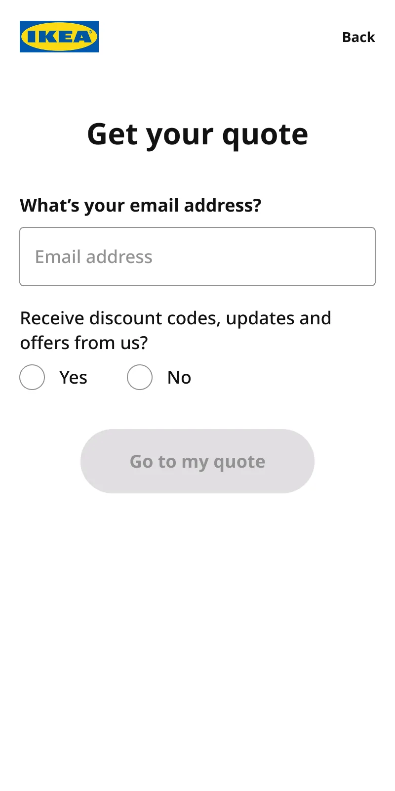
We produced numerous mockups exploring different co-branding approaches across both PCW results pages and the direct journey. The final solution is context-dependent rather than fixed:
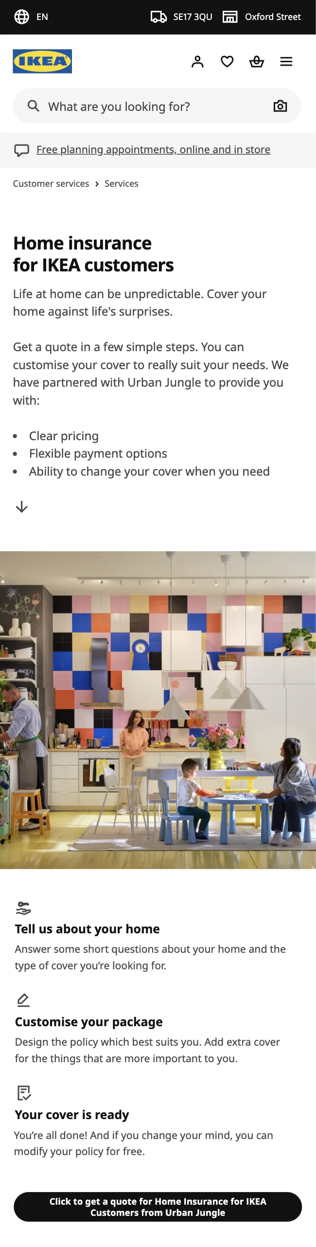
At journey entry, a prominent shared logo, where trust and transparency matter most and the customer is making a decision about who they're buying from.
On PCW results rows, a more IKEA-forward design, where logo real estate is constrained and recognition has to do the work in a few pixels.
The hardest negotiation was with Ingka, the entity that owns the IKEA trademark. Their concern was how clearly customers were told the product is administered by Urban Jungle.
We produced numerous mockups exploring different co-branding approaches across both PCW results pages and the direct journey. The final solution is context-dependent rather than fixed:
At journey entry, a prominent shared logo, where trust and transparency matter most and the customer is making a decision about who they're buying from.
On PCW results rows, a more IKEA-forward design, where logo real estate is constrained and recognition has to do the work in a few pixels.

THIS CO-BRANDED DEMO IS LIVE
A final few questions
These questions are very important and if answered incorrectly could invalidate your cover.
Nobody that will be insured on the policy has ever been declared bankrupt, served with any County Court Judgements (CCJs), Individual Voluntary Arrangement (IVAs) or arrangements with creditors.
The external walls and roof are made of standard construction and the building does not have a listed status.
To the best of your knowledge, your property, or any of your neighbouring properties has never suffered damage from subsidence, heave or landslip, been repaired or have any visible cracks in the internal or external walls.
Nobody that will be insured on the policy has ever been declined or refused insurance or had a policy cancelled or voided by any insurer.
Nobody insured on the policy has any unspent criminal convictions (other than speeding fines).
The home insured on the policy is currently in a good state or repair, free from damage or defect and is not currently undergoing building work, and none is planned during the period of insurance.
The home is your primary residence and will never be unoccupied or unfurnished for more than 30 consecutive days in a row.
You are not aware of any existing circumstances that could lead to a claim under the Legal Expenses section of your cover.
A final few questions
These questions are very important and if answered incorrectly could invalidate your cover.
Nobody that will be insured on the policy has ever been declared bankrupt, served with any County Court Judgements (CCJs), Individual Voluntary Arrangement (IVAs) or arrangements with creditors.
The external walls and roof are made of standard construction and the building does not have a listed status.
To the best of your knowledge, your property, or any of your neighbouring properties has never suffered damage from subsidence, heave or landslip, been repaired or have any visible cracks in the internal or external walls.
Nobody that will be insured on the policy has ever been declined or refused insurance or had a policy cancelled or voided by any insurer.
Nobody insured on the policy has any unspent criminal convictions (other than speeding fines).
The home insured on the policy is currently in a good state or repair, free from damage or defect and is not currently undergoing building work, and none is planned during the period of insurance.
The home is your primary residence and will never be unoccupied or unfurnished for more than 30 consecutive days in a row.
You are not aware of any existing circumstances that could lead to a claim under the Legal Expenses section of your cover.
A final few questions
These questions are very important and if answered incorrectly could invalidate your cover.
Nobody that will be insured on the policy has ever been declared bankrupt, served with any County Court Judgements (CCJs), Individual Voluntary Arrangement (IVAs) or arrangements with creditors.
The external walls and roof are made of standard construction and the building does not have a listed status.
To the best of your knowledge, your property, or any of your neighbouring properties has never suffered damage from subsidence, heave or landslip, been repaired or have any visible cracks in the internal or external walls.
Nobody that will be insured on the policy has ever been declined or refused insurance or had a policy cancelled or voided by any insurer.
Nobody insured on the policy has any unspent criminal convictions (other than speeding fines).
The home insured on the policy is currently in a good state or repair, free from damage or defect and is not currently undergoing building work, and none is planned during the period of insurance.
The home is your primary residence and will never be unoccupied or unfurnished for more than 30 consecutive days in a row.
You are not aware of any existing circumstances that could lead to a claim under the Legal Expenses section of your cover.
Prototypes as the alignment tool
Prototypes as the alignment tool
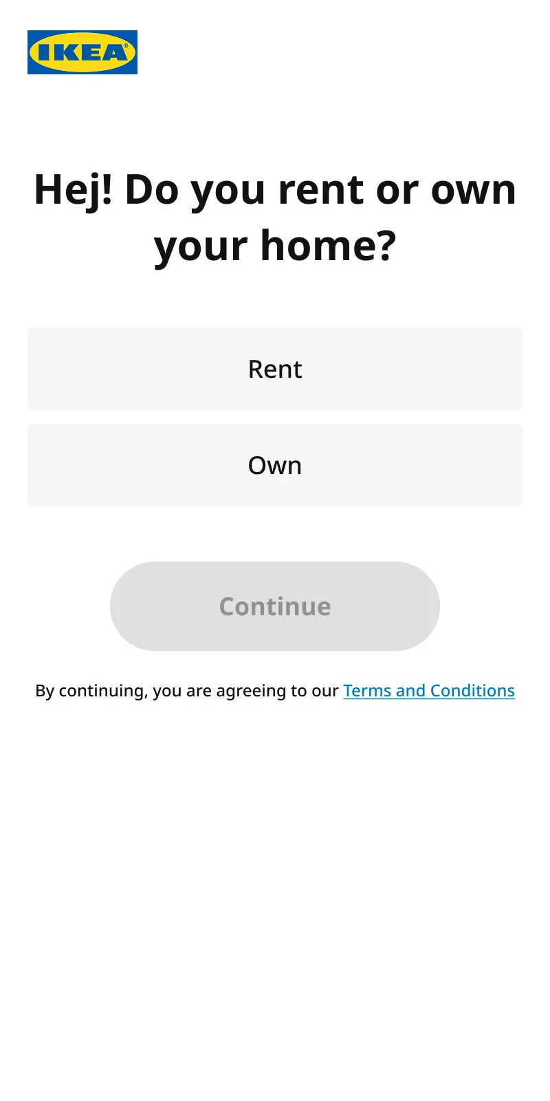
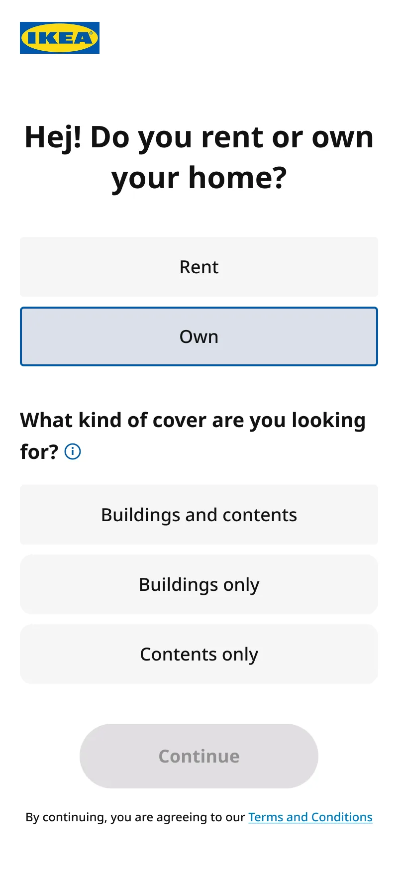
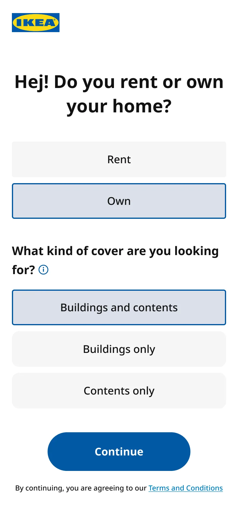
I used Figma Make and Claude Code to produce clickable prototypes fast enough to bring into IKEA UK's early review cycles. Showing how the brand moved and behaved across interactions, rather than presenting static screens, gave stakeholders the confidence to sign off on UX decisions.
I used Figma Make and Claude Code to produce clickable prototypes fast enough to bring into IKEA UK's early review cycles. Showing how the brand moved and behaved across interactions, rather than presenting static screens, gave stakeholders the confidence to sign off on UX decisions.
SOLUTION: PART 2
Improving the journey
Improving the journey
Fixing IKEA and Urban Jungle at the same time
IKEA's audience skews more mainstream than ours, and we expected it to skew more mobile too. That pressure made existing friction impossible to ignore — so the re-skin became a chance to fix it.
Mobile first
56% of Urban Jungle customers buy on their phone, but the journey was built desktop-first. For IKEA we flipped it. Designing for thumb reach and shorter attention spans surfaced layout improvements that had nothing to do with branding.
Mobile first
56% of Urban Jungle customers buy on their phone, but the journey was built desktop-first. For IKEA we flipped it. Designing for thumb reach and shorter attention spans surfaced layout improvements that had nothing to do with branding — just better UX, now available to both brands.

Consolidating key flows
83% of customers add Out of Home cover and want to declare high-value items worth over £2K.
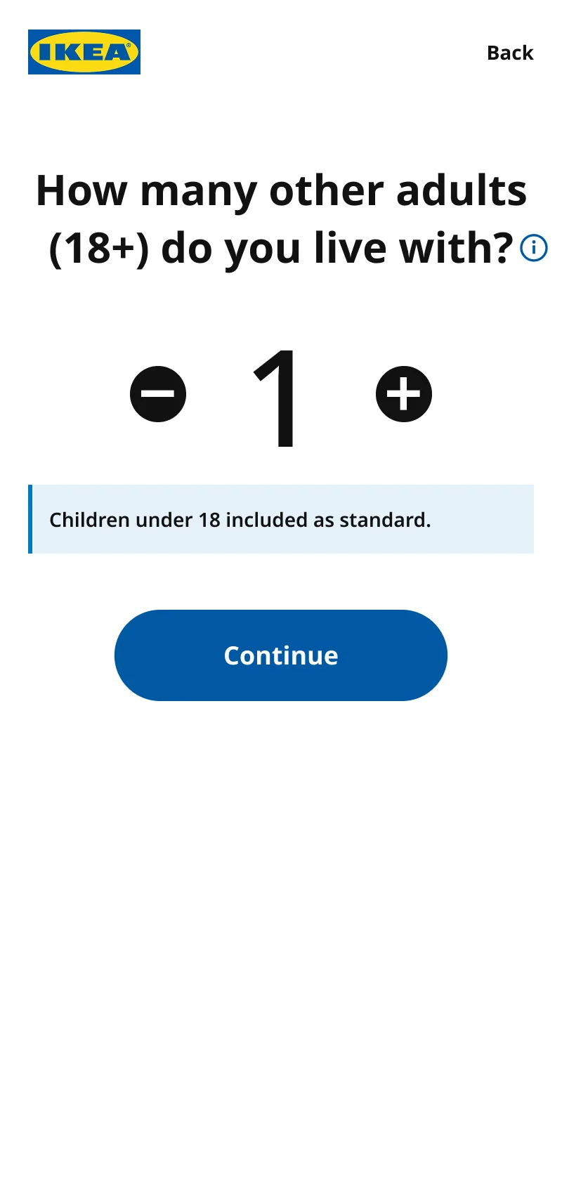
On Urban Jungle, adding items and adjusting the cover level were two separate steps with an awkward pattern to adjust your cover level after. For IKEA we collapsed all the desired actions into a single component within a single view.
Consolidating key flows
83% of customers add Out of Home cover and want to declare high-value items worth over £2K.
On Urban Jungle, adding items and adjusting the cover level were two separate steps with an awkward pattern to adjust your cover level after. For IKEA we collapsed all the desired actions into a single component within a single view
Declaring an item and setting the cover it sits under now happen in the same view. The price updates as you go, and there's no second page to return from.
31% → 8% of customers who went back to adjust their cover level after declaring an item
22% → 6% of customers who answered yes to the £2K question but never declared an item
SOLUTION: PART 3
PCW: launching on the proven journey
PCW: launching on the proven journey
Experimenting with A/B tests and including refinements drawn from Urban Jungle's trading initiatives and recent user research:
Experimenting with A/B tests and including refinements drawn from Urban Jungle's trading initiatives and recent user research:
We ran an experiment that failed
We ran an experiment that failed
In parallel, we A/B tested a one-page PCW checkout on Urban Jungle. The hypothesis was that a simpler, continuous flow would lift conversion. It produced a statistically significant 12% drop.
IKEA launched on the proven multi-page journey. Making that call meant giving up the more elegant design — but launching a partner brand on an unvalidated flow was a risk that belonged to us, not to IKEA.
In parallel, we A/B tested a one-page PCW checkout on Urban Jungle. The hypothesis was that a simpler, continuous flow would lift conversion. It produced a statistically significant 12% drop.
IKEA launched on the proven multi-page journey. Making that call meant giving up the more elegant design — but launching a partner brand on an unvalidated flow was a risk that belonged to us, not to IKEA.
Giving customers options
Giving customers options
Re-added the Good / Better / Best page across both the Home and Contents-only PCW journeys, ordered Basic first, directly addressing the finding that contents customers would pay more when the upgrade was legible.
Re-added the Good / Better / Best page across both the Home and Contents-only PCW journeys, ordered Basic first, directly addressing the finding that contents customers would pay more when the upgrade was legible.
Making value visible and consice
Making value visible and consice
Rebuilt the PCW payment-page price card to show all included cover at a glance, so the education happens before the payment decision rather than after it.
Rebuilt the PCW payment-page price card to show all included cover at a glance, so the education happens before the payment decision rather than after it.
OUTCOME
The impact
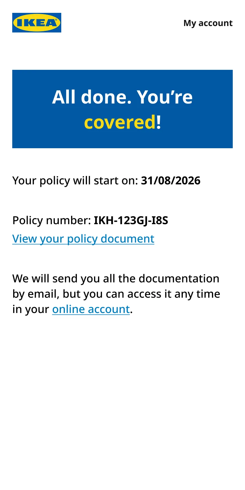
We went live with 3 insurance products (Home, Buildings-only and Contents-only insurance) directly from IKEA's website and on 4 PCW sites (MoneySuperMarket, GoCompare, Compare The Market and Confused.com). With a full account manager portal that allowed customers to edit their policy, make claims and update payment details.
Here's what the first month looked like:
Consolidating key flows
83% of customers add Out of Home cover and want to declare high-value items worth over £2K.
On Urban Jungle, adding items and adjusting the cover level were two separate steps with an awkward pattern to adjust your cover level after. For IKEA we collapsed all the desired actions into a single component within a single view.
Consolidating key flows
83% of customers add Out of Home cover and want to declare high-value items worth over £2K.
On Urban Jungle, adding items and adjusting the cover level were two separate steps with an awkward pattern to adjust your cover level after. For IKEA we collapsed all the desired actions into a single component within a single view.
OVERVIEW
Urban Jungle partnered with IKEA UK to launch a white-label home insurance product across direct and Price Comparison Website (PCW) channels.
The goal was to deliver a fully white-label, conversion-optimised experience across direct and PCW channels, proving that sub-brand partnerships could unlock meaningful new volume without compromising on brand integrity or user experience.
10M+
IKEA Family members in the UK
95.6%
of PCW home insurance users are on the four platforms we integrated with
53%
of consumers choose a known brand over a cheaper unknown on a PCW
Copyright © 2026 Tess Goulandris.
All Rights Reserved.
Copyright © 2026 Tess Goulandris.
All Rights Reserved.